
Tractus Trail
Project Type: Product Design
Role: Sole UX/UI designer + Front-End Developer
Industry: Health Education, Higher Education
Tools: Figma, Adobe Creative Suite, Elementor
Duration: 1 Month
THE CHALLENGE
Students exploring careers in healthcare often lack a clear starting point. With so many potential paths—each requiring different education, timelines, and institutions—the process can feel overwhelming and unstructured.
Tactus Trail needed to:
-
Help students explore a wide range of healthcare career paths
-
Guide them toward the right educational programs and partner schools
-
Create an engaging, interactive experience that reflects a sense of progression
-
Ultimately drive applications to affiliated institutions
I designed Tactus Trail as an interactive, journey-based experience that guides students from self-discovery to actionable next steps.
By prompting users to start with subjects they excel in, the platform dynamically surfaces relevant healthcare career paths, educational requirements, and partner programs. The interface visually reinforces this progression through a “pathway” metaphor—using motion and transitions to create a sense of forward momentum.
The result is a guided, personalized experience that helps students confidently navigate their options while seamlessly connecting them to programs where they can take the next step.
THE SOLUTION
THE PROCESS
Empathize — Research & User Understanding
Students exploring careers in healthcare are often faced with an overwhelming number of options, each with different educational paths, timelines, and requirements. Many don’t know where to begin, and traditional resources tend to present information in a static, list-based format that lacks guidance.
Rather than needing more information, students need direction—a way to connect their existing strengths and interests to realistic career paths.
This insight reframed the problem: instead of building a tool to display options, Tactus Trail needed to guide users through them.
Define — Problem Statements & Requirements
The core challenge was to transform a complex and often overwhelming decision-making process into a structured, engaging experience.
Tactus Trail needed to:
-
Help users explore healthcare careers without feeling overloaded
-
Provide a clear connection between personal strengths and potential paths
-
Guide users toward relevant educational programs and partner institutions
-
Encourage meaningful action, including program applications
This led to a guiding design principle:
Create a structured journey that starts with familiarity, supports exploration, and leads to confident decision-making.
BRANDING

Primary & Secondary Colors
#00ABB9
#1D384C
#00B65E

Ideate — Content Strategy, IA & Solution Exploration
With a clear direction established, I explored multiple ways to present career pathways in a way that felt intuitive and engaging.
Early concepts included:
-
Traditional list-based layouts with filtering options
-
Quiz-style experiences that match users to careers
-
Dashboard-style interfaces with expandable content
While each approach provided access to information, they lacked a sense of progression and guidance—key needs identified during the discovery phase.
This led to the exploration of a more structured, narrative-driven approach.
Evolving the Concept
I shifted toward designing an experience centered around a journey-based pathway.Instead of overwhelming users with choices upfront, the experience would:
-
Start with a familiar input (subjects or strengths)
-
Reveal options progressively
-
Guide users step-by-step toward deeper exploration and action
This approach balanced user control with guided direction, allowing students to explore without feeling lost.
Design Direction
The final concept focused on creating an experience that feels:
-
Guided, not restrictive
-
Interactive, not static
-
Progressive, not overwhelming
By framing the experience as a path, users are continuously moving forward—building confidence as they go and staying engaged through each step.
Prototype — Wireframes, Flows & High-Fidelity UI

-
Created low- and high-fidelity wireframes in XD
-
Developed a cohesive visual system—typography, color, spacing, iconography
-
Designed flexible, responsive components and page templates
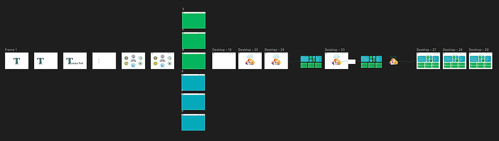

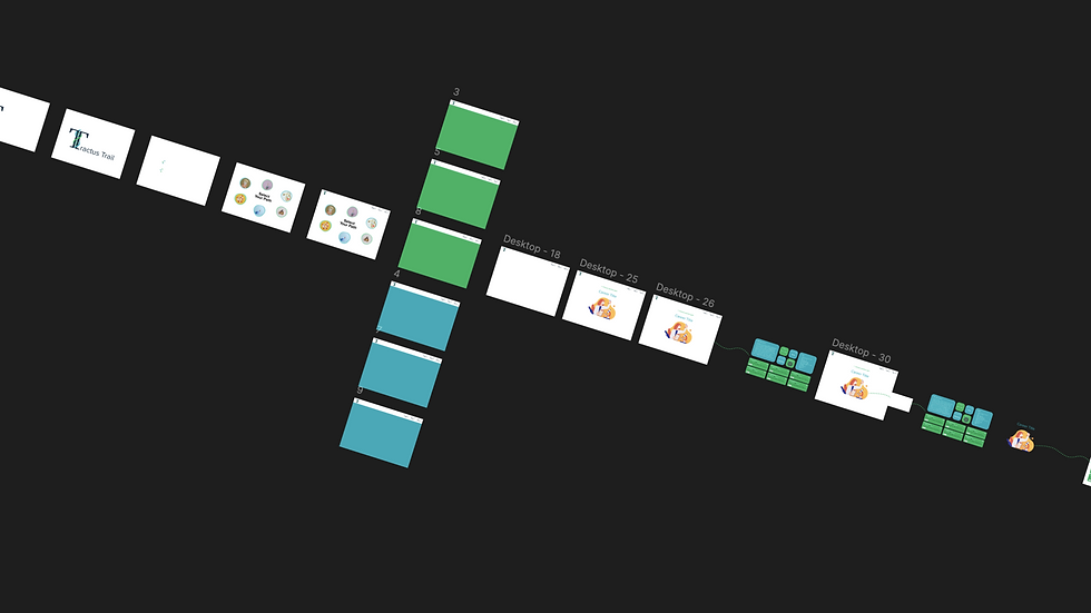
This first interactive screen invites users to choose a medical field they’re interested in. Upon selection, a guided animation transitions them to the next stage, reinforcing the sense of progression.
Hi-Fidelity Desktop
Hi-Fidelity Phone
The second step introduces detailed information about the selected career, along with live job opportunities. Highlighting open positions helps demonstrate industry demand and adds credibility to the pathway.

Test — Usability Testing & Iteration
Although Tactus Trail did not move into full development, I gathered informal feedback throughout the design process from internal stakeholders, including a project manager and developer.
Early walkthroughs helped validate the core concept of a guided, journey-based experience. Stakeholders responded positively to the pathway metaphor, noting that it made career exploration feel more approachable and less overwhelming compared to traditional list-based tools.
Feedback also highlighted areas for refinement:
-
Ensuring career information remained concise and easy to scan
-
Balancing animation with performance and usability
-
Clarifying next steps to better support conversion into program exploration
These insights informed iterative design adjustments, strengthening both the clarity and usability of the experience.
Implement — Development, QA & Launch
Although Tactus Trail remained a conceptual project, I approached its design with implementation in mind from the start, ensuring that the experience could be built efficiently and perform well across devices.
Key implementation considerations included:
-
Dynamic content structure: Each career path needed to be modular so the experience could adapt based on the user’s input.
-
Interactive pathways: Animations and transitions were designed to guide users without overwhelming the interface or causing performance issues.
-
Responsive design: Layouts were planned to work seamlessly across desktop and mobile screens, ensuring accessibility for all students.
-
Developer handoff: Components were structured in Figma with clear naming conventions and notes, making it easier for developers to translate designs into a working product.
-
QA mindset: Even at the concept stage, I considered potential points of friction and usability issues, including readability, navigation clarity, and visual consistency.
While the project did not reach launch, these considerations reflect a full-cycle design approach, from concept to production-ready design, and set the stage for future development of student-focused career exploration tools.
THE RESULTS
Validated the journey-based approach
Demonstrated design for scalability
Influenced future student tools
LESSONS LEARNED
Simplicity enhances engagement
Design with implementation in mind
Feedback is critical, even internally